Designing drag and drop for everyone
I designed a fully keyboard and screen-reader accessible drag-and-drop pattern for lists for D2L's design system (used in D2L Brightspace).
The pattern was responsive, tested with assistive technology users through FABLE, and designed to work within Daylight's existing list component. D2L filed a patent for this interaction in 2022.

My Role: Product Designer, led interaction design, accessibility, research, and design-system documentation.
1 Principal Designer, 1 Dev Manager, 3 Senior Developers
October, 2021-September, 2022 (part time)
Background: Brightspace has many lists
D2L Brightspace is a large learning management system used across higher education, K–12, and corporate learning environments. Within Brightspace, there are a lot of lists: lists of activities, users, courses, assignments, and more.
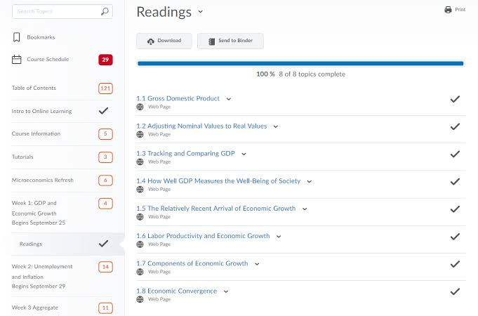

Images are two of many "lists of things" in Brightspace. Left is the content tool (list of content and list of modules), and the right is a list of courses
In many of these lists, order matters. Users need to be able to rearrange items to match how they want their content organized, especially if they want learners to view the content in a specific order. D2L's design system, Daylight, needed a new, accessible pattern for reordering items in a list.
My Process
My process for designing accessible drag and drop was Align, Explore, UX Research, Make, and Ship. In Align, I defined the problem and dug into Daylight's list component, its complexity, and the different use cases the pattern needed to support. In Explore, I explored different approaches to making drag and drop accessible while balancing usability, accessibility, and the constraints of the existing component. In UX Research, I tested my most promising direction with real assistive technology users through FABLE, which helped me understand how people actually navigated and interacted with the pattern. In Make, I used those findings to iterate on the interaction, refine the keyboard and screen-reader behaviour, and develop the final pattern and documentation. Finally, in Ship, we implemented the pattern into Daylight and began rolling it out across Brightspace in late 2021/early 2022.
Align: The list component is complicated, and drag and drop isn't inherently accessible

There was also a bigger accessibility challenge: drag and drop is designed around using a mouse and being able to see where you're moving something. That doesn't work particularly well for people who use a keyboard or assistive technology.
So the question became: how could we make reordering a list accessible while keeping the interaction simple, compact, and as close to the existing drag-and-drop experience as possible?
Explore: How could we reorder list items without adding a lot of UI, and still make it all accessible?
I started with researching how others handled drag and drop. Drag and drop isn't a net new pattern, so I thought there might be a more standardized way to do this. Turns out, while traditional "click and drag" drag and drop patterns are very similar, accessible patterns have many variations.


Testing out Google photos and Trello drag and drop. Google photos did have a keyboard version of drag and drop, but as you can see, the cursor for where your item is going is not visible.
Through this research I started to see companies go down two different paths:
Path 1: Companies using Move Up and Move Down buttons in a context menu (e.g. Trello on the cards)
Path 2: A wide open field of interesting implementations (e.g. Google photos with the grey box and line) — these implementations were all pretty unique, but they attempted to make drag and drop nice to use for keyboard users, even if they were a little clunky.
I decided I wanted to go down Path 2, with Path 1 as a back up option. Path 2 felt more intentional — I didn't want to just have reordering buried in the options for keyboard users, I wanted reordering to be just as easy on a keyboard as it would be on a mouse.
One of the first explorations suggested by a designer in a critique was to think about separate buttons that could move the list item up and down. They could be in addition to the drag handle, or only appear when the drag handle was on keyboard focus.
This was a solid interaction because each button was a clear focus target with one obvious function. The problem was that it introduced an extra tab stop, and users had to use Space or Enter to trigger the action. It also introduced more UI to an already busy component.

An image of different drag handle explorations on list items.
From here, I started thinking about whether or not we could use the arrow keys for list re-ordering. After some investigation, I learned that D2L's list component already had a built in ARIA grid, meaning I could use up and down arrows on one focusable element to reorder the list. This narrowed my exploration down to a single button that could reorder up or down via the arrow keys.
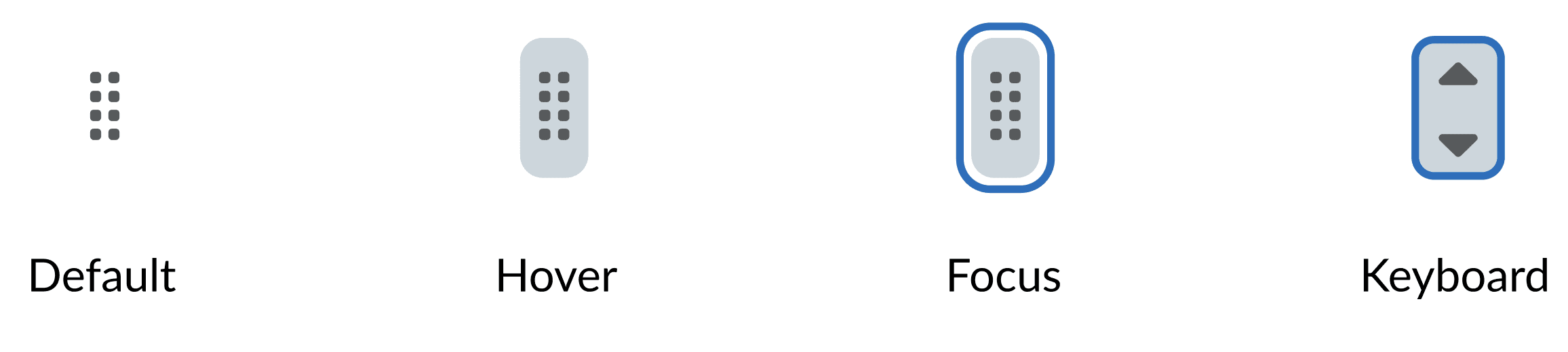
These were the 4 states I had for the drag handle in my most confident exploration.
I also spent time exploring the traditional click and drag method, which also needed to be designed for this pattern. In these explorations, I focused on making the pick up, placement, and drop off moments clear and visible. The thick blue line, "cardify-ing" (my term for making the list item a carded list item) the list, and other small interactions all played a role in the final design of traditional drag and drop with a mouse.

The main image I used to communicate how drag and drop with a mouse would work. The list item would become a card, and the user could drag the item to its new position in the list.
The Result: I landed on a keyboard-first approach that worked within the existing list component without adding extra UI. The next step was figuring out whether it actually made sense to the people who would use it.
Research: Testing Drag and Drop with users of assistive technology
Because this was a net-new interaction on assistive technology that I didn't regularly use, I needed to test the design with real users and see where it worked well and where iteration needed to happen. I wanted to understand how people would actually navigate the interaction, what information they needed, and whether the experience made sense when using assistive technology.
To test this, I worked with a front-end developer to create a lightweight "dumb prototype". This prototype didn't have a back end or store any data. Instead, it recreated the front-end interaction closely enough that we could share it with participants and test it as a real web experience.

Note: Exact prototype cannot be shown due to confidentiality -- the image on the right is a rough recreation of what we tested.
We tested the prototype with assistive technology users through FABLE. The research helped me gain insight on how assistive technology users interacted with a website in general, and specific insights into our prototype. Here are a few examples of our findings:
Finding: Assistive technology users rarely rely on just one input method. The participants we tested often switched between multiple technologies, including tools that replaced a traditional mouse.
Design change: This showed me that keyboard controls alone weren't enough. Users might still prefer click-and-drag with their assistive technology, so I designed the drop indicator to stay within the list. If a user overshot the top or bottom, the blue line stayed anchored there, making placement possible even with less precise mouse movement.

An image of some of the technology our test participants used.

We added a tool tip
Finding: The drag handle and screen-reader instructions on their own were not enough, people were still occasionally looking for instructions.
Design Changes: We added a tool tip that appeared on the drag handle on focus.
Additional findings omitted due to confidentiality.
The Result: Testing with assistive technology users changed more than just the keyboard interaction. We learned that users switch between different input methods and need clear feedback about where they are in the list. These findings helped us refine both the keyboard and mouse interactions, resulting in a pattern that supported different ways of navigating and moving items.
Make: Bringing the final interactions together
The final interaction allowed users to focus a list item and use the arrow keys to move it through the list, while providing concise position information through the screen reader.

One of many design specifications for drag and drop — this was outlining some of the keyboard controls.

I also spent time making sure all of the screen-reader information was concise, precise, and clearly told the user where list items were and where they would land.
Additionally, even though we already had a fully accessible keyboard interaction, I added Move Up and Move Down buttons in the context menu. If a user didn't want to use drag and drop at all, Move Up and Move Down is a predictable alternative.

Move Up and Move down buttons on list items in the context menu.
The final pattern supported three ways to accomplish the same task: drag and drop for mouse users, arrow-key movement for keyboard users, and Move Up / Move Down actions as an alternative method.
Traditional Drag and Drop: Use a mouse to click and drag the items up and down the list.

Drag and drop via keyboard: Focus on a list item, press SPACE or ENTER, and use the arrow keys to move the list item up and down. Includes full screen-reader support.
Additional Move Up and Move Down buttons in the context menu for all draggable lists.
The Result: The final design brought the different interaction methods together into one cohesive component. Drag and drop remained available for users who wanted it, while keyboard controls and a context menu provided alternative ways to reorder items.
Ship: An accessible design pattern for list items — now everyone can drag and drop!
The accessible drag-and-drop pattern was implemented across Brightspace list items and continues to be used in the product. It has remained accessible through subsequent WCAG updates and gives keyboard and assistive technology users the ability to reorder lists without relying on a mouse. It was added to Daylight and rolled into Brightspace as a reusable pattern and part of the list component, giving teams a consistent way to build accessible reordering interactions across the product.
In 2022, D2L filed a design patent specifically for our method of moving items within a list via keyboard 🎉
This project re-inforced something I have carried in all of my design work since: accessibility isn't something to layer onto an interaction after it's designed. The strongest solution came from considering keyboard and assistive technology users as part of the interaction model from the beginning, and then testing that model with real people. Accessible drag and drop also shaped how I approach complex interaction design more generally: start with the constraints, prototype at the fidelity needed to answer the question, and use real user behaviour to decide what happens next.